
Share
.svg)
.svg)
.svg)

Accurate, accessible data continues to be one of the most imperative assets available to higher education institutions. While the accuracy and availability of data are crucial, the numbers are irrelevant if they aren’t understood or contextualized. With this in mind, data visualization is a critical tool for colleges and universities.
Having the ability to query and obtain enrollment, financial aid, budgetary, student success, and other types of data is an important first step; however, if relevant stakeholders don’t understand the analytics, they’re of little use. Data visualization tells the story of the metrics identified, creating buy-in and leading to effective action. While there are many methods, I thought I’d share an example approach for data visualization with you.
Data visualization in action
Let’s explore a “Makeover Monday” exercise I undertook with Tableau a few years back. I searched through Tableau’s available datasets and found “Average Tuition in the United States” (see May 2016).
This is the original data visualization example presented to be made over:
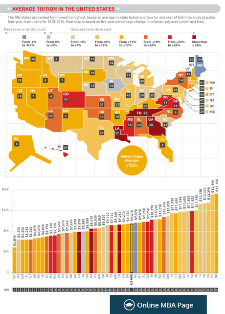
This “before makeover” version includes a “heatmap” of the United States using color to indicate each state’s change in public four-year institution tuition over five years. Additionally, a bar chart sorted by average tuition cost per state sits below with colorization to match the map.
This visualization does effectively highlight the states with the largest changes in tuition cost, as well as the highest and lowest tuition amounts. However, the sheer amount of information in these visuals is overwhelming to process quickly for comparison. As noted above, the value in data visualization is for the observer to be able to quickly and effectively identify the relevant takeaways being presented.
Identify the questions you plan to answer
This provides a good opportunity to lay out some important data visualization best practices. Before you design any visualization, you should first define what question(s) you’re trying to answer—the story you want to tell. In this case, I wanted to illustrate the increase in tuition costs by state each year alongside “benchmark” reference values. This would allow the user to compare one state’s trend to overall trends, as well as those of other states. I also wanted a quick summary of “before and after” tuition costs which compares the cost by state at the earliest and latest dates in the chart.
So, the questions I decided I wanted answers to were:
- “How did my state’s average public college tuition change between 2004 and 2015?”
- “How did that compare to changes during the same time period in other states?”
- “What was the overall percent change in tuition during that time period?”
Because I wasn’t asking any questions dealing with geography, I didn’t have a need for a map, so I decided not to use Tableau’s (admittedly beautiful) mapping functionality in order to reduce clutter and ensure my visualization is telling the story I want efficiently and effectively.
.png?width=700&height=219&name=CTA%20Template%20Illustration%20(17).png)
Observe how others present similar datasets
In addition to defining what question(s) you want to answer, you should also look to see if there are quality examples already out there so that you can learn from others’ designs. One example of a great makeover, designed by Andy Kriebel on his VizWiz blog, got close to what I had in mind, and answered my same questions (Interactive version available on Tableau Public):
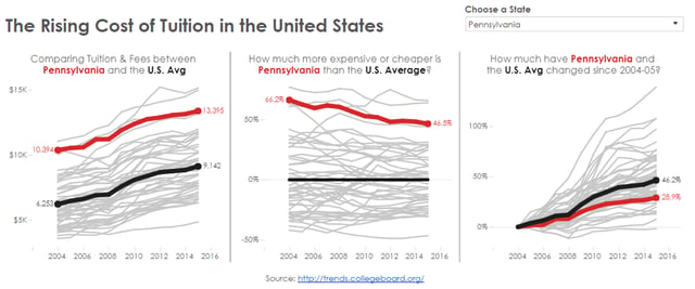
These charts have the U.S. average trendline in black and the selected state’s trendline in red, with light gray lines for the rest of the states acting as a “background” to show the overall range of values. I like how Andy’s design minimized “data overwhelm” while highlighting key trends and values relative to a baseline.
I wanted my interactive dashboard to operate similarly, but thought I’d create a version that didn’t include all 50+ gray lines. I also wanted to add bar charts to easily visualize the earliest (2004) and latest (2015) available data points per state. This allowed me to illustrate overall change, as well as year-by-year trends.
Here’s my data visualization in action:
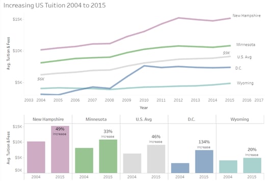
The light gray line and bars in my dashboard indicate U.S. average values. I also labeled the lowest and highest values at each end of the line for easy reference without having to look across to the y-axis. You can see in the bar chart that the overall increase in U.S. average tuition was 46%, and you can see how that compares to some reference states.
I selected four states to display as reference values. I chose these particular states because New Hampshire had the highest cost in most recent years, Wyoming had the lowest cost in most recent years, D.C. had an interesting sharp increase between 2008 and 2010 and a very large percent increase overall, and Minnesota had a trend very similar to the U.S. average, though at a higher amount, filling the gap between the U.S. average and New Hampshire. I thought these states showed a good variety of values from the data.
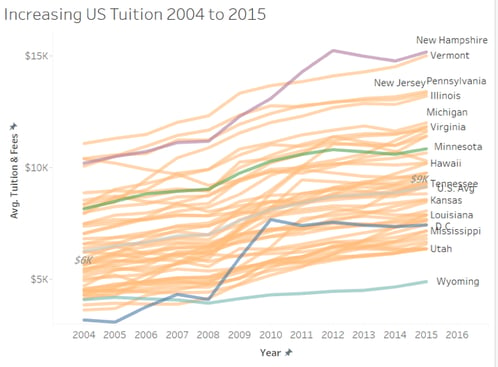
If I had overlaid the lines that weren’t visible in the default display, you can see they largely lie in between the ones I selected:
Minimize visual clutter
The way this interactive visualization is designed to work, the state trendlines won’t all be displayed at one time. This is aligned with the best practice to keep your data visualization reduced to the most imperative takeaways. You can always provide further drill-downs for those who would like to gain deeper analytical insights, but visual clutter reduces your ability to tell a clean, concise data narrative.
The idea is that the user would select a single state to add to the default selections for comparison. Any added state appears in a bright orange color, highlighting the selected state to facilitate visual comparison.
For example, when my home state of Virginia is selected, its line and bar charts are added to the dashboard like so:
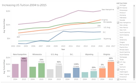
The user can quickly see in the line chart that Virginia’s average tuition is above the U.S. average for the entire time period, and it has increased at a sharper rate than most of the reference lines between 2013 and 2015, crossing to be above Minnesota’s average tuition for the first time in 2014. The bottom bar chart shows the “first year vs. last year” comparison, and the label indicates that Virginia’s tuition increased by 68% overall between 2004 and 2015.
I chose to add the state name labels to the lines and each pair of bars and exclude a color legend for ease of reference and reading, as well as to make the chart more accessible to colorblind viewers. The hover-text, which you can see in the interactive version, indicates the average tuition dollar amount and percent change since 2004 on each trendline data point.
Tell your institution’s story using data visualization
As evidenced by the example above, your Tableau dashboard can be designed in different ways to visualize data. While I made these visualizations a few years back now, the principles I used throughout my process still apply. The methodology by which you present your metrics can have a vital impact on how well it’s understood, as well as how actionable the takeaways are. By identifying the question(s) you’d like to answer, exploring and learning from others’ visualizations, and reducing visuals to the most important takeaways, you create actionable datasets with understandable stories—making it easier to communicate with and get your stakeholders on board.
Are you looking to level-up your data storytelling efforts? My team at HelioCampus can help! We offer a standard set of visualizations that help make your data actionable and understandable, with customizable dashboards based on your rules and specifications.
And for more insight on how to make data accessible, read our case study to learn how HelioCampus partnered with Villanova University to help them create a strong and sustainable data infrastructure, enhanced data governance, and build an operational framework to maximize ROI for the university’s initiatives.
FAQs:
[Updated April 2025. A version of this blog was originally published in October of 2017.]